A while back I was watching a Youtube video from Mike Maloney. In that video he referenced a chart that I found very intriguing.
I took it upon myself to reproduce the chart from scratch and share it with others.
<h1>The Chart</h1>
Take some time and look at this chart and see what you notice...
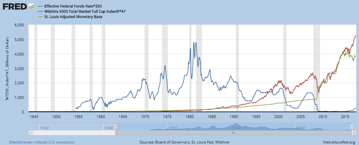
<h1>3 Simple Lines & 2 Indicators</h1>
❶ The blue curve represents the Effective Federal Funds Rate. This is the interest rate at which depository institutions lend reserve balances.
❷ The red curve shows the Wilshire 5000 Total Market Full Cap Index. This basically represents the top 5000 stocks in the US, encompassing virtually 100% of the US stock market capitalization.
❸ The green curve represents the Adjusted Monetary Base. It accounts for all currency in circulation including coin.
❹ The vertical gray bars represent economic recessions.
❺ The white spaces between the gray bars represent economic expansions.
<h1>First Off</h1>
We are currently in the 3rd largest (since 1857) economic expansion currently sitting at 96+ months, only falling short to two previous ones at 120 months and 106 months. Around Feb 2018 we will surpass third place and be living in the second longest economic expansion. Sometime in 2019 we will live in the longest economic expansion since 1857. The average economic expansion is under 40 months. So we are due for a recession just around the corner.
<h1>Most Shocking Part</h1>
To me, the most shocking aspect of the chart is noticing how the Wilshire 5000 and the base currency was decoupled and uncorrelated up to the 2008-2009 financial crisis. In late November 2008, Mr. Ben Bernanke turned on his fancy printing press and magically injected 100's of billions of dollars into the arteries of the financial system. He set off a firework show with what was dubbed Quantitative Easement. Turns out they did this for 4 rounds, QE1, QE2, QE3 and QE4. In late 2014, Ben turned off the printing press with the total net effect of inflating out money supply by about 400%!
There must be consequences for this... right?
Notice how in late November 2008 that the Wilshire 5000 started to collapse and (without a doubt) was uplifted by the injection of new base currency. From then on, the Wilshire 5000 and the base currency was correlated to an unprecedented level.
In conjunction with fresh base currency propping up the stock markets, the Federal Funds Rate (interest rate) fell to a historical low of 0%.
<h1>A Closer Look</h1>
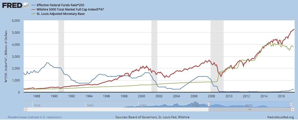
Here is slightly more zoomed in version.
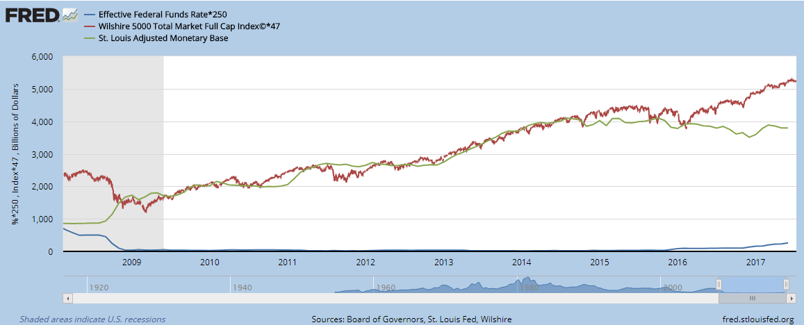
Further zoomed in version showing the uncanny correlation from late 2008 to late 2014.
<h1>Help Me Out</h1>
Here is where I need some help understanding this chart. Around early 2016 the base currency supply started to contract while the Wilshire 5000 exploded upward. What is happening here? Whatever it is gives me weakened confidence in the markets after seeing what happened.
Many before me have made predictions of a correction coming. Looking at these 3 simple curves gives give one the heebie jeebies regarding the health and equilibrium of our markets.
Can a currency supply be manipulated on such levels and continue on? If so, then for how long and at what costs?
<h1>Thanks For Reading</h1>
If you like the content I post, please comment with your thoughts and follow. I would love to hear other peoples thoughts on this and have a discussion below.
Up vote if you think it deserves it.
Follow me on Twitter for more content not shown here. <a href="https://twitter.com/Bit_Informant">@Bit_Informant</a>
Thanks for reading and learning 🙌
<h1>Sources</h1>
If you are interested in the source for this chart please visit my source chart over at the FRED
https://fred.stlouisfed.org/graph/?g=6vtd
Other sources:
http://www.businessinsider.com/duration-of-us-economic-expansions-since-the-1850s-2015-4