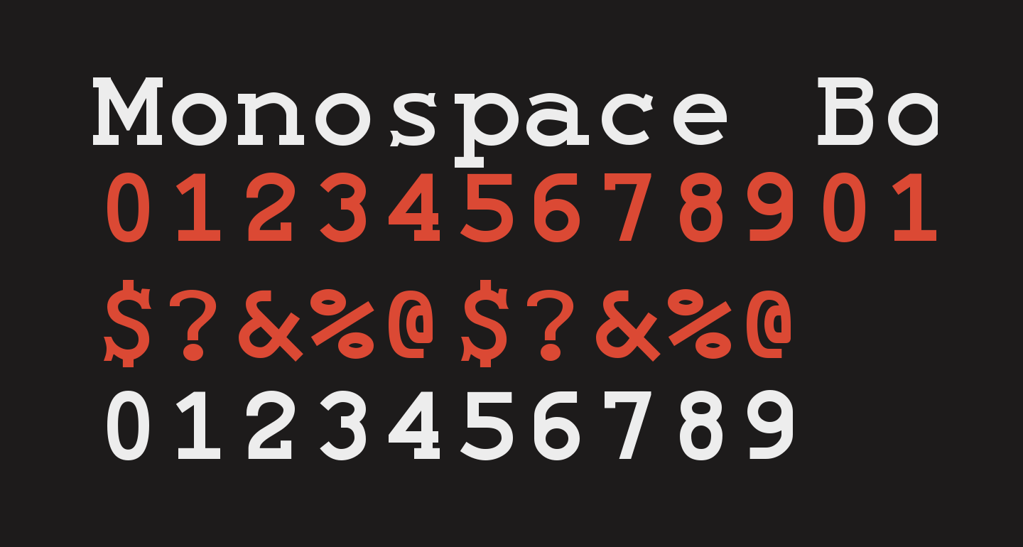
 Do you ever use a monospace font? Monospace fonts are like the output of an old typewriter: fonts where every single letter takes up the exact same space. This is quite different from most fonts these days, which are variable width fonts; that is to say, each letter takes up a different amount of space, based on the letter. For example "l" takes up a lot less space than "m", so a variable width font will make that "l" only as wide as it needs to be, resulting in the l sitting more snuggly against the other letters in a word. Variable width fonts look nicer when reading, so they’ve become the standard. There are a few groups whose members do lean towards using monospace fonts and a few applications for which they work better. 1. Programmers One of the most frustrating things when coding is when you have a compile error, and then you then have to hunt through the code for what is wrong. Did you forget the ; at the end of the line, or a comma somewhere or what? It can sometimes be maddening tracking down simple type errors. Monospace fonts make it much easier to see mistakes like this. Just consider the semicolon. In a variable spaced font it can hug the previous letter, making it hard to spot if you used one or not, but in a monospaced font it will hover in it's own space, making it easier to see. It's the difference between p; and p ;, where the space makes punctuation more visible. 2. Copyeditors & proofreaders Mainly for the same reason as the above. When you are hunting for spelling and punctuation mistakes, having a monospaced font that makes the letters and symbols stand more apart makes the mistakes easier to find. This group will often takes the additional step of printing out the text and hunting for these mistakes with a red pen. Something about having the monospaced print on physical paper just also makes them easier to see whereas on the screen you might skip over them. 3. Writers, especially Screenwriters Many writers also prefer monospaced fonts, not only for the reasons listed above, but also using a monospaced font makes it easier to maintain alignment. This last reason is much more important to screenwriters, as movie scripts traditionally rely on a format that depends on alignment. 4. Accountants & Bookkeepers As mentioned above, monospaced fonts allow us to align things much easier, making it easier to line up numbers in columns. There are more groups, I'm sure, but those are the main ones who generally prefer monospaced fonts. I've been using monospaced fonts for over 25 years, since my computer science days at university. When I am enjoying reading, such as on my Kindle, I prefer a variable width font. It just makes things look nicer and makes reading smoother. Lately I've been using [Lexend](https://www.lexend.com/), which is designed to make reading easier. [I wrote a little about this font here](https://www.lexend.com/). But when I'm writing or coding, I use a monospace font. For the past few years, I've been using [Inconsolata](https://levien.com/type/myfonts/inconsolata.html). I also sometimes switch to [Source Code Pro](https://github.com/adobe-fonts/source-code-pro) or [Consolas](https://learn.microsoft.com/en-us/typography/font-list/consolas) just to change things up. All three of those were designed for coding (I think) but they do perfectly well for writing as well. <center>![][divider]</center> If you are curious to try to find a monospaced font that suits you, you might enjoy this site: [CodingFont](https://www.codingfont.com). It pits various monospaced fonts against each other in a tournament, showing two next to each other at a time and allowing you to pick your favorite of each as you step through the tournament brackets. There is a checkbox to hide the font names so you can remove bias. Give it a shot! [divider]: https://images.hive.blog/0x0/https://images.ecency.com/DQmR3iwCn9yvwXDXfuNjmMX6FrjAvFfYQWgA4QRckpens1j/external_content.duckduckgo.png <center><h1>❦</h1></center> <table><tbody> <tr> <td><img src="http://68.media.tumblr.com/9ed59bcbc3d0c81b382b0df883f91773/tumblr_inline_ni2uuza1ku1qz4uph.jpg" alt="Hi there!"></td> <td><a href="https://hive.blog/about/@dbooster/about-david-laspina-v1-2">David LaSpina</a> is an American photographer and translator lost in Japan, trying to capture the beauty of this country one photo at a time and searching for the perfect haiku. He blogs here and at <a href="https://laspina.org">laspina.org</a>. Write him on <a href="https://twitter.com/dbooster">Twitter</a> or <a href="https://famichiki.jp/@dbooster">Mastodon</a>.</td> </tr> </tbody></table>
| author | dbooster |
|---|---|
| permlink | monospace-font-nerdery |
| category | hive-140084 |
| json_metadata | {"app":"peakd/2024.11.1","format":"markdown","tags":["thealliance","pimp","creativecoin","neoxian","archon","proofofbrain","cent","indiaunited"],"users":["dbooster"],"image":["https://files.peakd.com/file/peakd-hive/dbooster/23tGwKswpqx373z5oT32QLxbzndYZHCzh1NDjy8bnswPTb5eMaDpExzCSn5JXtGDhBi4b.png","https://images.ecency.com/DQmR3iwCn9yvwXDXfuNjmMX6FrjAvFfYQWgA4QRckpens1j/external_content.duckduckgo.png","http://68.media.tumblr.com/9ed59bcbc3d0c81b382b0df883f91773/tumblr_inline_ni2uuza1ku1qz4uph.jpg"]} |
| created | 2024-11-13 00:07:42 |
| last_update | 2024-11-13 00:07:42 |
| depth | 0 |
| children | 1 |
| last_payout | 2024-11-20 00:07:42 |
| cashout_time | 1969-12-31 23:59:59 |
| total_payout_value | 6.566 HBD |
| curator_payout_value | 6.518 HBD |
| pending_payout_value | 0.000 HBD |
| promoted | 0.000 HBD |
| body_length | 4,761 |
| author_reputation | 1,044,315,363,386,342 |
| root_title | "Monospace Font Nerdery " |
| beneficiaries | [] |
| max_accepted_payout | 1,000,000.000 HBD |
| percent_hbd | 10,000 |
| post_id | 138,424,258 |
| net_rshares | 37,959,444,934,429 |
| author_curate_reward | "" |
| voter | weight | wgt% | rshares | pct | time |
|---|---|---|---|---|---|
| jacor | 0 | 2,911,799,113 | 5% | ||
| akipponn | 0 | 36,226,595,553 | 50% | ||
| shadowspub | 0 | 9,356,038,391 | 5% | ||
| daveks | 0 | 35,910,730,980 | 1% | ||
| dadview | 0 | 28,110,307,831 | 50% | ||
| yadamaniart | 0 | 83,457,092,852 | 50% | ||
| bigtakosensei | 0 | 2,791,418,715 | 2.5% | ||
| dreemsteem | 0 | 26,151,322,546 | 10% | ||
| elizacheng | 0 | 16,009,629,696 | 9% | ||
| c0ff33a | 0 | 1,936,800,965,055 | 50% | ||
| freebornsociety | 0 | 3,006,862,445 | 5.53% | ||
| frankydoodle | 0 | 675,162,246 | 5% | ||
| underground | 0 | 778,843,437 | 3% | ||
| enginewitty | 0 | 50,159,844,282 | 100% | ||
| bitcoinman | 0 | 23,190,150,398 | 15% | ||
| iroha | 0 | 3,958,051,962 | 100% | ||
| dabeckster | 0 | 2,280,561,090 | 30% | ||
| gohba.handcrafts | 0 | 593,575,396 | 7% | ||
| cryptoknight12 | 0 | 11,624,094,620 | 35.5% | ||
| deadgrlsuppastar | 0 | 4,361,735,424 | 8% | ||
| djynn | 0 | 69,441,210,710 | 80% | ||
| sircork | 0 | 17,076,997,721 | 50% | ||
| vm2904 | 0 | 144,703,805,817 | 100% | ||
| saffisara | 0 | 102,581,289,640 | 100% | ||
| chinito | 0 | 12,277,064,035 | 54% | ||
| mamadini | 0 | 12,112,219,229 | 75% | ||
| progressivechef | 0 | 9,976,634,899 | 25% | ||
| hardikv | 0 | 6,552,872,017 | 50% | ||
| edthecanadian | 0 | 8,029,972,604 | 43% | ||
| summertooth | 0 | 3,679,451,347 | 75% | ||
| nolasco | 0 | 1,094,034,090 | 5% | ||
| rafalski | 0 | 1,286,645,056 | 90% | ||
| michaeldavid | 0 | 1,666,663,375 | 50% | ||
| amblog | 0 | 32,661,086,240 | 45% | ||
| nyinyiwin | 0 | 1,087,281,218 | 50% | ||
| fiftysixnorth | 0 | 11,517,243,540 | 30% | ||
| bambukah | 0 | 26,593,239,757 | 32% | ||
| geneeverett | 0 | 129,474,537,608 | 100% | ||
| moeknows | 0 | 121,863,193,314 | 75% | ||
| buggedout | 0 | 186,700,555,817 | 5% | ||
| coolbuddy | 0 | 1,441,514,933 | 50% | ||
| vikar | 0 | 5,460,371,570 | 10% | ||
| silverstackeruk | 0 | 724,884,444,814 | 25% | ||
| killerwhale | 0 | 47,272,401,120 | 100% | ||
| felander | 0 | 541,120,582,995 | 100% | ||
| noloafing | 0 | 1,978,755,746 | 35.5% | ||
| snowpea | 0 | 1,961,676,936 | 40% | ||
| rumplestiltskin | 0 | 28,265,900,919 | 100% | ||
| calatorulmiop | 0 | 1,141,972,474 | 10% | ||
| bobthebuilder | 0 | 934,438,566 | 50% | ||
| pixresteemer | 0 | 45,289,317,792 | 13% | ||
| splash-of-angs63 | 0 | 4,961,526,730 | 20% | ||
| ghazanfar.ali | 0 | 21,689,929,522 | 100% | ||
| silvergoldbotty | 0 | 84,814,886,996 | 100% | ||
| thealliance | 0 | 2,054,604,300,962 | 100% | ||
| steemitcomics | 0 | 1,452,016,166 | 100% | ||
| steemseph | 0 | 12,528,760,701 | 10% | ||
| brisby | 0 | 1,598,984,036 | 5% | ||
| simgirl | 0 | 19,376,656,203 | 50% | ||
| coolguy123 | 0 | 4,791,460,089 | 3% | ||
| thekittygirl | 0 | 511,372,294,497 | 100% | ||
| anomallies | 0 | 9,943,535,560 | 100% | ||
| imisstheoldkanye | 0 | 87,283,286,972 | 100% | ||
| eonwarped | 0 | 33,679,103,182 | 8% | ||
| bluefinstudios | 0 | 13,933,665,940 | 5% | ||
| maxinpower | 0 | 207,586,280,726 | 100% | ||
| youarehope | 0 | 27,600,952,068 | 100% | ||
| byn | 0 | 8,905,151,688 | 40% | ||
| tyedyefirepower | 0 | 2,733,678,980 | 40% | ||
| mytechtrail | 0 | 5,610,249,640 | 5% | ||
| afifa | 0 | 1,253,965,464 | 15% | ||
| syndicates | 0 | 45,136,148,908 | 100% | ||
| a11y | 0 | 128,463,552,140 | 100% | ||
| sneakyninja | 0 | 11,923,359,532 | 17.75% | ||
| aitommylr | 0 | 77,570,322,115 | 90% | ||
| crescendoofpeace | 0 | 20,496,908,468 | 25% | ||
| jzerpa | 0 | 486,507,047 | 100% | ||
| thedolphincocoon | 0 | 107,872,191,412 | 80% | ||
| blue.panda | 0 | 1,869,070,042 | 50% | ||
| themothership | 0 | 46,151,452,807 | 50% | ||
| irisworld | 0 | 5,053,576,244 | 15% | ||
| josejirafa | 0 | 1,197,665,605 | 5% | ||
| emjoe | 0 | 5,264,120,433 | 50% | ||
| platosgroove | 0 | 1,144,166,571 | 50% | ||
| bengy | 0 | 6,853,472,756 | 10% | ||
| cygon | 0 | 4,463,897,962 | 50% | ||
| christianyocte | 0 | 2,891,480,929 | 10% | ||
| bala41288 | 0 | 691,522,641,218 | 20% | ||
| roger.remix | 0 | 1,212,004,717 | 100% | ||
| lanzjoseg | 0 | 35,125,551,703 | 61% | ||
| steemflagrewards | 0 | 380,031,764,850 | 100% | ||
| ilhuna | 0 | 1,208,285,200 | 20% | ||
| unconditionalove | 0 | 12,873,213,410 | 50% | ||
| psyborg | 0 | 10,878,784,533 | 100% | ||
| antdroid | 0 | 11,182,547,170 | 100% | ||
| khimgoh | 0 | 83,737,210,065 | 50% | ||
| upfundme | 0 | 11,871,731,491 | 34.71% | ||
| mastergerund | 0 | 9,898,464,026 | 35.5% | ||
| hazem91 | 0 | 6,584,339,258 | 30% | ||
| oredebby | 0 | 575,857,460 | 5% | ||
| ericburgoyne | 0 | 2,710,299,802 | 5% | ||
| bigtom13 | 0 | 161,883,349,077 | 33% | ||
| dimsyto | 0 | 462,765,860 | 10% | ||
| heruvim78 | 0 | 1,079,652,386 | 5% | ||
| katrina-ariel | 0 | 36,413,186,888 | 100% | ||
| bozz | 0 | 1,015,265,522,761 | 60% | ||
| jjerryhan | 0 | 75,339,784,894 | 30% | ||
| cryptictruth | 0 | 273,977,713,504 | 50% | ||
| blockchainyouth | 0 | 18,778,115,936 | 25% | ||
| musicapoetica | 0 | 1,795,792,998 | 50% | ||
| silverd510 | 0 | 21,270,778,528 | 71% | ||
| abrockman | 0 | 317,764,921,084 | 100% | ||
| shoemanchu | 0 | 11,618,430,115 | 100% | ||
| wildo | 0 | 1,459,414,635 | 50% | ||
| joseantpp | 0 | 984,613,894 | 50% | ||
| sbi2 | 0 | 3,622,245,556,053 | 92.75% | ||
| emotionalsea | 0 | 573,794,315 | 15% | ||
| flaxz | 0 | 1,843,459,887 | 1.5% | ||
| philippekiene | 0 | 11,869,998,028 | 50% | ||
| mumma-monza | 0 | 5,989,170,333 | 50% | ||
| monchhichi23 | 0 | 6,478,977,895 | 100% | ||
| mraggaj | 0 | 163,408,425,099 | 100% | ||
| veteranforcrypto | 0 | 4,337,010,430 | 20% | ||
| slobberchops | 0 | 636,038,983,639 | 9.6% | ||
| enforcer48 | 0 | 219,333,077,397 | 20% | ||
| swisswitness | 0 | 487,280,951 | 100% | ||
| steemulant | 0 | 85,605,042 | 5.83% | ||
| ambiguity | 0 | 11,739,415,377 | 25% | ||
| thedailysneak | 0 | 16,212,790,984 | 17.75% | ||
| alliedforces | 0 | 125,062,900,730 | 100% | ||
| fiberfrau | 0 | 1,230,542,520 | 5% | ||
| voxmortis | 0 | 18,675,891,906 | 10% | ||
| thesummoner | 0 | 10,642,700,791 | 100% | ||
| babysavage | 0 | 6,166,477,220 | 35.5% | ||
| ravensavage | 0 | 3,409,674,997 | 35.5% | ||
| lunamoon | 0 | 4,462,990,588 | 100% | ||
| khaldeesi | 0 | 4,169,977,576 | 100% | ||
| freyamber | 0 | 4,793,435,014 | 100% | ||
| mk992039 | 0 | 756,236,208 | 5% | ||
| cliffagreen | 0 | 25,780,300,559 | 50% | ||
| guurry123 | 0 | 3,479,687,671 | 10% | ||
| ecoinstats | 0 | 1,014,441,425,101 | 100% | ||
| admiralbot | 0 | 7,164,784,303 | 100% | ||
| athunderstruck | 0 | 8,650,336,910 | 20.4% | ||
| ecosaint | 0 | 103,544,018,952 | 100% | ||
| chain.games | 0 | 21,427,203,049 | 100% | ||
| ladyangelwolf | 0 | 1,423,432,567 | 100% | ||
| sepone | 0 | 2,280,707,138 | 100% | ||
| r-e-d | 0 | 7,689,850,337 | 100% | ||
| slothlydoesit | 0 | 15,547,997,729 | 10% | ||
| whiterosecoffee | 0 | 64,097,644,222 | 25% | ||
| lord-of-the-d | 0 | 10,535,611,434 | 100% | ||
| steemforsteem | 0 | 993,078,608 | 100% | ||
| toonuts | 0 | 2,266,286,485 | 100% | ||
| twonuts | 0 | 2,304,714,380 | 100% | ||
| lolasophiedanton | 0 | 2,118,238,497 | 90% | ||
| go-kyo | 0 | 72,780,414,431 | 100% | ||
| memehub | 0 | 104,381,615,305 | 100% | ||
| letlove | 0 | 2,917,830,646 | 100% | ||
| allied-mafia | 0 | 8,416,736,286 | 100% | ||
| imagenius | 0 | 751,089,289 | 100% | ||
| steemforschool | 0 | 991,170,088 | 100% | ||
| steemforschools | 0 | 1,217,521,369 | 100% | ||
| itwasme | 0 | 1,494,463,084 | 100% | ||
| huntforsteem | 0 | 16,357,817,088 | 100% | ||
| tinyhousecryptos | 0 | 463,930,504 | 5% | ||
| aninsidejob | 0 | 7,503,575,281 | 100% | ||
| leighscotford | 0 | 3,875,117,634 | 5% | ||
| spinvest | 0 | 235,508,745,380 | 18.75% | ||
| freemonster | 0 | 685,521,971 | 20% | ||
| paltraseven | 0 | 20,343,007,530 | 100% | ||
| x40l1n | 0 | 48,895,139,765 | 100% | ||
| theblooded | 0 | 1,000,871,869 | 100% | ||
| blooded | 0 | 1,000,938,120 | 100% | ||
| theclan | 0 | 2,012,156,438 | 100% | ||
| fambalam | 0 | 150,733,567,896 | 100% | ||
| milu-the-dog | 0 | 1,030,250,949 | 100% | ||
| angeltree | 0 | 2,031,229,071 | 100% | ||
| thealliancebank | 0 | 15,062,495,282 | 100% | ||
| alliedbanking | 0 | 1,170,070,623 | 100% | ||
| christmasclub | 0 | 2,238,202,747 | 100% | ||
| bala-ag | 0 | 112,930,723 | 20% | ||
| binodkatuwal | 0 | 1,875,954,322 | 100% | ||
| publicview | 0 | 22,721,990,429 | 100% | ||
| maddogmike | 0 | 11,725,267,635 | 8% | ||
| the.lazy.panda | 0 | 3,134,266,824 | 50% | ||
| sbi-tokens | 0 | 27,288,685,140 | 35.5% | ||
| curtawakening | 0 | 828,007,796 | 10% | ||
| iamraincrystal | 0 | 6,657,954,479 | 5% | ||
| elianaicgomes | 0 | 1,890,861,464 | 5% | ||
| bradleyarrow | 0 | 8,589,022,311 | 10% | ||
| kanibot | 0 | 42,922,729,024 | 20% | ||
| natural.alfa | 0 | 1,071,345,042 | 100% | ||
| baltai | 0 | 31,408,605,909 | 11.57% | ||
| bozz.sports | 0 | 7,015,712,678 | 5% | ||
| birthdaywishes | 0 | 1,019,211,364 | 100% | ||
| rcaine | 0 | 1,844,902,571 | 3% | ||
| youdo | 0 | 2,457,228,697 | 100% | ||
| bi0digital | 0 | 10,111,741,743 | 100% | ||
| wittys.angels | 0 | 1,031,008,606 | 100% | ||
| wittysangels | 0 | 1,031,016,135 | 100% | ||
| chmoen | 0 | 1,598,641,187 | 5% | ||
| prize.hoard | 0 | 11,307,964,898 | 100% | ||
| hive-123585 | 0 | 1,574,464,040 | 100% | ||
| treasure.hoard | 0 | 755,056,492,312 | 100% | ||
| alliedfun | 0 | 1,133,040,057 | 100% | ||
| tommys.shop | 0 | 7,965,174,078 | 50% | ||
| dpend.active | 0 | 1,334,342,511 | 3.55% | ||
| brofund | 0 | 41,122,645,606 | 46.28% | ||
| burnhive | 0 | 1,235,583,457 | 100% | ||
| paydice | 0 | 54,333,777,243 | 100% | ||
| vancouverpics | 0 | 1,898,878,178 | 100% | ||
| theterminal | 0 | 306,166,756,677 | 80% | ||
| hive-161465 | 0 | 90,975,409,185 | 100% | ||
| ykretz | 0 | 1,424,107,854 | 15% | ||
| imfarhad | 0 | 20,220,552,180 | 20% | ||
| dcityrewards | 0 | 4,771,157,904,320 | 100% | ||
| sketching | 0 | 2,235,073,518 | 17.75% | ||
| teamuksupport | 0 | 38,781,430,999 | 25% | ||
| archon-gov | 0 | 151,927,148,792 | 100% | ||
| newigennity | 0 | 54,319,091,670 | 100% | ||
| jilt | 0 | 4,879,155,390 | 12.5% | ||
| stickupboys | 0 | 10,601,580,006 | 100% | ||
| angiel | 0 | 23,869,791,188 | 100% | ||
| sassafrass | 0 | 1,956,033,988 | 100% | ||
| captaincryptic | 0 | 34,521,355,027 | 50% | ||
| eddie-earner | 0 | 712,360,428,805 | 23.75% | ||
| mightyrocklee | 0 | 82,114,511,255 | 5% | ||
| communityunity | 0 | 52,554,748,559 | 100% | ||
| nathalie-s | 0 | 960,761,155 | 5% | ||
| ismaelrd04 | 0 | 3,521,481,514 | 50% | ||
| dhedge | 0 | 110,613,773,057 | 20% | ||
| bellelynn | 0 | 6,563,216,098 | 100% | ||
| heruvim1978 | 0 | 1,935,875,487 | 5% | ||
| emeraldtiger | 0 | 472,396,209 | 3% | ||
| he-index | 0 | 16,497,457,938 | 10% | ||
| hive-112281 | 0 | 1,395,415,683 | 5% | ||
| tergan604 | 0 | 1,278,156,176 | 100% | ||
| cryptounicorn420 | 0 | 39,935,429,634 | 95% | ||
| dr460n3y3 | 0 | 1,704,291,340 | 100% | ||
| b34w0lf | 0 | 6,632,790,598 | 100% | ||
| pokerarema | 0 | 438,313,338,389 | 100% | ||
| cryptosneeze | 0 | 6,134,310,052 | 12.5% | ||
| cookaiss | 0 | 556,271,336 | 9.37% | ||
| hametaro | 0 | 4,703,127,044 | 50% | ||
| hive-111011 | 0 | 727,164,785 | 40.8% | ||
| bobthebuilder2 | 0 | 46,417,333,712 | 50% | ||
| thecryptopimp | 0 | 7,659,969,798 | 40.8% | ||
| tokenpimp | 0 | 509,774,115,771 | 40.8% | ||
| pimptoken | 0 | 5,123,284,885 | 40.8% | ||
| pimp.token | 0 | 2,545,696,232 | 40.8% | ||
| biglove | 0 | 468,608,190 | 10% | ||
| brofi | 0 | 2,394,447,604,843 | 46.28% | ||
| failingforward | 0 | 927,657,372 | 40% | ||
| timmy-turnip | 0 | 5,876,614,307 | 50% | ||
| arc-echo | 0 | 6,505,720,754 | 25% | ||
| nfttunz | 0 | 413,528,527,870 | 23.14% | ||
| brofund-witness | 0 | 13,408,250,749 | 46.28% | ||
| photo-hive-five | 0 | 1,471,963,711 | 100% | ||
| zwhammer | 0 | 510,417,927 | 23.14% | ||
| merit.ahama | 0 | 11,138,975,960 | 3% | ||
| stickupmusic | 0 | 574,981,662 | 100% | ||
| bellou61 | 0 | 1,319,765,349 | 100% | ||
| rqr4 | 0 | 3,237,794,438 | 10% | ||
| ifarmgirl | 0 | 24,401,291,660 | 4% | ||
| alkirua | 0 | 825,637,766 | 10% | ||
| darmst5339 | 0 | 61,753,752,091 | 66% | ||
| darmst | 0 | 737,414,528 | 100% | ||
| dibblers.dabs | 0 | 88,561,568,323 | 20.4% | ||
| kamaleshwar | 0 | 2,896,829,106 | 20% | ||
| chandra.shekar | 0 | 13,840,889,176 | 20% | ||
| kannannv | 0 | 32,414,099,794 | 20% | ||
| biggerjoe | 0 | 1,403,549,717 | 1.5% | ||
| cccf | 0 | 11,465,158,098 | 50% | ||
| bokica80 | 0 | 6,139,598,547 | 23.14% | ||
| darmstrong | 0 | 4,921,058,840 | 100% | ||
| trentonlundy1 | 0 | 5,901,390,375 | 50% | ||
| purasia | 0 | 783,711,625 | 50% | ||
| penta555 | 0 | 8,322,450,190 | 100% | ||
| olympicdragon | 0 | 1,160,142,454 | 100% | ||
| dirego1 | 0 | 3,301,125,042 | 50% | ||
| sakurakko | 0 | 379,673,128,119 | 100% | ||
| iamleicester | 0 | 481,741,069 | 80% | ||
| rzc24-nftbbg | 0 | 11,314,880,420 | 5% | ||
| vrezyy | 0 | 971,837,130 | 2.5% | ||
| alovely088 | 0 | 1,293,875,247 | 2% | ||
| kungfukid | 0 | 9,036,608,796 | 5% | ||
| mxm0unite | 0 | 487,511,268 | 17.75% | ||
| iproto | 0 | 8,851,870,934 | 23.14% | ||
| ijat | 0 | 9,983,238,707 | 68% | ||
| arc7icwolf | 0 | 24,912,838,250 | 10% | ||
| cantfoldaces | 0 | 4,972,901,287 | 50% | ||
| hive-165007 | 0 | 3,177,226,263 | 75% | ||
| thebigfish | 0 | 146,272,669,696 | 75% | ||
| stickupcash | 0 | 615,019,771 | 100% | ||
| tillmea | 0 | 664,842,857 | 100% | ||
| tydynrain | 0 | 14,620,727,809 | 10% | ||
| thebighigg | 0 | 30,553,589,477 | 50% | ||
| mrskjp | 0 | 2,408,672,717 | 100% | ||
| alzee | 0 | 2,336,181,975 | 8% | ||
| swearingradio | 0 | 3,069,345,262 | 75% | ||
| rc-assist | 0 | 23,958,552,401 | 70% | ||
| thekrazypoet | 0 | 1,637,783,134 | 50% | ||
| chaosmagic23 | 0 | 893,808,888 | 5% | ||
| svanbo | 0 | 880,743,828 | 0.5% | ||
| rakhmen | 0 | 1,327,845,775 | 50% | ||
| brucegryllis | 0 | 1,594,045,206 | 50% | ||
| hoosie | 0 | 34,819,971,303 | 12.5% | ||
| hutorou | 0 | 626,413,882 | 50% | ||
| littlebee4 | 0 | 84,690,119,427 | 20% | ||
| hopestylist | 0 | 1,749,899,986 | 1.5% | ||
| balaz | 0 | 43,903,097,226 | 20% | ||
| haveyaheard | 0 | 14,630,900,118 | 100% | ||
| leemah1 | 0 | 473,437,815 | 5% | ||
| amakauz | 0 | 1,245,196,138 | 5% | ||
| pimpdistrict | 0 | 1,562,700,849 | 40.8% | ||
| thepimpdistrict | 0 | 2,674,378,012 | 40.8% | ||
| sabosuke | 0 | 2,933,570,638 | 100% | ||
| beststart | 0 | 15,138,030,800 | 5% | ||
| javeson | 0 | 6,426,727,337 | 50% | ||
| tokencav | 0 | 97,059,273,957 | 100% | ||
| oneplanet | 0 | 478,938,344 | 5% | ||
| mdasein | 0 | 607,134,965 | 5% | ||
| prasiatko | 0 | 597,352,646 | 0.5% | ||
| fasacity | 0 | 1,025,928,944 | 5% | ||
| wittyzell | 0 | 43,887,193,646 | 50% | ||
| theblockpartyii | 0 | 1,308,005,988 | 100% | ||
| llunasoul | 0 | 625,153,392 | 1.11% | ||
| growandbow | 0 | 13,154,962,298 | 1.11% | ||
| toekins | 0 | 6,355,579,621 | 100% | ||
| iwannabeme | 0 | 6,698,604,426 | 50% | ||
| glimpsytips.dex | 0 | 6,318,891,971 | 19% | ||
| w1tty | 0 | 3,398,663,862 | 100% | ||
| idksamad78699 | 0 | 2,524,805,186 | 5% | ||
| goodloan | 0 | 1,430,544,199 | 100% | ||
| assistance | 0 | 10,935,074,309 | 100% | ||
| monsterrerentals | 0 | 26,992,197,067 | 100% | ||
| pinkchic | 0 | 774,078,343 | 2.4% | ||
| ifarmgirl-leo | 0 | 965,391,540 | 15% | ||
| salicj | 0 | 7,466,332,613 | 16% | ||
| liseth.zamora | 0 | 13,705,952,837 | 100% | ||
| pegnovak | 0 | 464,774,313 | 50% | ||
| tawthar | 0 | 502,921,798 | 100% | ||
| slothbuzz | 0 | 19,464,123,237 | 50% | ||
| winanda | 0 | 1,010,234,027 | 5% | ||
| willendorfia | 0 | 7,427,641,051 | 100% | ||
| empressjay | 0 | 557,456,917 | 5% | ||
| whitneyalexx | 0 | 1,556,819,541 | 5% | ||
| wearelegion | 0 | 41,736,628,984 | 75% | ||
| vetfunding | 0 | 14,568,455,461 | 50% | ||
| slothburn | 0 | 17,119,952,677 | 80% | ||
| tengolotodo.leo | 0 | 1,376,585,908 | 5% | ||
| luchyl | 0 | 800,613,613 | 2% | ||
| hive-140084 | 0 | 564,031,976 | 10% | ||
| susieisclever | 0 | 973,903,034 | 5% | ||
| coinjoe | 0 | 8,268,456,384 | 5% | ||
| eds-vote | 0 | 2,208,200,118,380 | 25% | ||
| dailydab | 0 | 327,202,494,230 | 12.5% | ||
| trautenberk | 0 | 20,112,730,250 | 100% | ||
| yummycruz1 | 0 | 2,195,621,709 | 50% | ||
| fc-curation | 0 | 5,286,783,901 | 10% | ||
| karina.yana | 0 | 469,245,174 | 100% | ||
| reyn-is-chillin | 0 | 734,048,622 | 50% | ||
| nism | 0 | 18,890,008,717 | 100% | ||
| d-a-d | 0 | 945,996,917 | 5% | ||
| hive-ja | 0 | 551,423,689,054 | 100% | ||
| madilyn02 | 0 | 22,894,107,773 | 100% | ||
| pepe.voter | 0 | 1,025,474,602 | 5% | ||
| clubvote | 0 | 127,489,360,856 | 40% | ||
| thetradecenter | 0 | 3,633,121,910 | 100% | ||
| wittythedev | 0 | 989,614,261 | 50% | ||
| hive-193566 | 0 | 8,100,770,492 | 31.25% | ||
| claudiavb | 0 | 1,652,398,641 | 5% | ||
| khantaimur | 0 | 576,529,425 | 5% | ||
| bulliontool | 0 | 2,885,657,881 | 50% | ||
| spi-store | 0 | 690,546,033,915 | 23.75% | ||
| indiasierra | 0 | 2,659,694,004 | 5% | ||
| yahya.umer.hayat | 0 | 674,042,465 | 5% | ||
| legionsupport | 0 | 1,382,045,195,727 | 75% | ||
| duo-curator | 0 | 406,486,680,609 | 62.5% | ||
| dab-vote | 0 | 136,603,437,777 | 10% | ||
| khipuqolqa | 0 | 424,721,594,700 | 100% | ||
| franco10 | 0 | 5,266,876,647 | 50% | ||
| debtests | 0 | 135,371,062,545 | 100% | ||
| pollenation | 0 | 29,177,875,863 | 100% | ||
| pollination | 0 | 177,413,193,926 | 100% | ||
| dook4good | 0 | 3,950,044,344 | 62.5% | ||
| hivestreams | 0 | 1,672,601,589 | 100% | ||
| blemish | 0 | 1,624,310,712 | 100% | ||
| tinamccabe | 0 | 1,479,752,837 | 50% | ||
| trovepower | 0 | 484,822,742 | 12.5% | ||
| endhivewatchers | 0 | 743,975,056 | 5% |
I guess I had never really thought about it before. It makes sense. I remember countless hours looking for the missing bracket on the green bar paper that was keeping my code from compiling correctly!
| author | bozz |
|---|---|
| permlink | re-dbooster-20241112t195747633z |
| category | hive-140084 |
| json_metadata | {"content_type":"general","type":"comment","tags":["hive-140084","thealliance","pimp","creativecoin","neoxian","archon","proofofbrain","cent","indiaunited"],"app":"ecency/3.1.6-mobile","format":"markdown+html"} |
| created | 2024-11-13 00:57:48 |
| last_update | 2024-11-13 00:57:48 |
| depth | 1 |
| children | 0 |
| last_payout | 2024-11-20 00:57:48 |
| cashout_time | 1969-12-31 23:59:59 |
| total_payout_value | 0.000 HBD |
| curator_payout_value | 0.000 HBD |
| pending_payout_value | 0.000 HBD |
| promoted | 0.000 HBD |
| body_length | 200 |
| author_reputation | 2,299,533,254,319,467 |
| root_title | "Monospace Font Nerdery " |
| beneficiaries | [] |
| max_accepted_payout | 1,000,000.000 HBD |
| percent_hbd | 10,000 |
| post_id | 138,424,975 |
| net_rshares | 0 |