Hi there. In this post, I showcase some plots in R with the `plotly` package. I have been using this [plotly cheatsheet](https://images.plot.ly/plotly-documentation/images/r_cheat_sheet.pdf) ~~as~~ and [their website for R](https://plot.ly/r/) as references.
Although I use `ggplot2` a lot in R, I think that `plotly` has some good features and the plots look pretty clean for the most part.
<center><img src="https://s3-us-west-1.amazonaws.com/plotly-tutorials/plotly-marketing-pages/images/new-branding/logo/images/plotly-logo-01-stripe%402x.png" /></center>
<center><a href="https://s3-us-west-1.amazonaws.com/plotly-tutorials/plotly-marketing-pages/images/new-branding/logo/images/plotly-logo-01-stripe%402x.png">Featured Image</a></center>
### Plots
---
* Scatterplot
* Line Plot
* Area Plot
* Bar Chart
* Histogram
* Box Plots
* 3D Scatterplot
---
To install `plotly` into R/RStudio use the code `install.packages("plotly")`. After installation, use `library(plotly)` to load in the package into R/RStudio.
The main function for plotting in `plotly` is `plot_ly()`.
**Scatterplot**
Generating a scatterplot is not too difficult. I think adding in labels and a title can be somewhat tricky as it takes time to get through some of the documentation.
```{r}
# Scatter Plot
plot_ly(x = c(2, 3, 5, 8, 10), y = c(1, 0, 4, 2, 8), type = "scatter", mode = 'markers') %>%
layout(xaxis = list(title = "\n x"),
yaxis = list(title = "y \n"),
title = "Simple Scatterplot \n")
```
<center>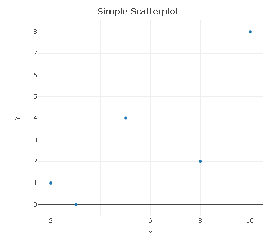</center>
**Line Plot**
A line plot is basically a scatterplot with a line(s) going through the points.
```{r}
# Line Plot:
plot_ly(x = c(2, 3, 5, 8, 10), y = c(1, 0, 4, 2, 8), type = "scatter", mode = "lines") %>%
layout(xaxis = list(title = "\n x"),
yaxis = list(title = "y \n"),
title = "Simple Line Plot \n")
```
<center>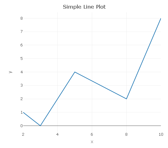</center>
**Area Plot**
A further extension would be adding a filled area under the line (curve).
```{r}
# Area Plot (Area Under A Line/Curve)
plot_ly(x = c(2, 3, 5, 8, 10), y = c(1, 0, 4, 2, 8), type = "scatter", mode = "lines",
fill = 'tozeroy')
```
<center>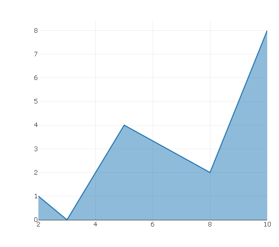</center>
**Bar Graph**
In the `plotly` bar graph, you need to input values for the horizontal axis and the counts in the vertical axis. I have changed the opacity to 0.5 to have the blue bars be lighter.
```{r}
# Bar Chart (Fake Survey):
plot_ly(x = c("Yes", "No"), y = c(54, 60), type = "bar", opacity = 0.5,
marker = list(color = 'rgb(158,202,225)',
line = list(color = 'rgb(8,48,107)', width = 1.5))) %>%
layout(xaxis = list(title = "\n Answer"),
yaxis = list(title = "Counts \n"),
title = "Bar Graph Example \n")
```
<center>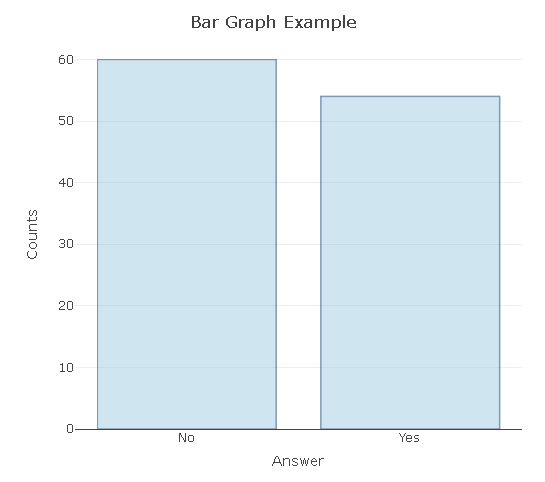</center>
**Histogram**
In this histogram example, I simulate/generate/sample 10000 standard normal random variables and plot the results in a histogram. The resulting histogram approximates the standard normal distribution density (bell shaped curve).
```{r}
# Histogram:
norm_rv <- rnorm(n = 10000, mean = 0, sd = 1)
plot_ly(x = norm_rv, type = "histogram") %>%
layout(xaxis = list(title = "\n Value"),
yaxis = list(title = "Counts \n"),
title = "Histogram Of Simulated Standard Normal Random Variables \n")
```
<center>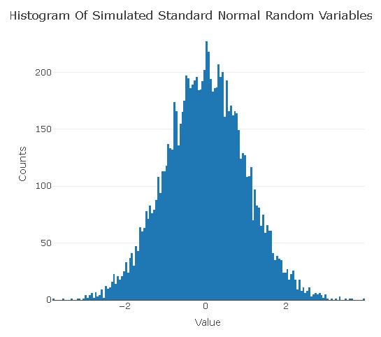</center>
**Box Plots**
```{r}
# Box Plot:
plot_ly(y = rnorm(100), type = "box")
```
<center>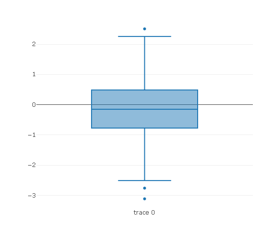</center>
The `add_trace()` function allows for an additional box plot. The second box plot is for chi-squared random variables. (A chi-squared random variable is the square of a normal random variable.)
```{r}
plot_ly(y = rnorm(100), type = "box") %>%
add_trace(y = rchisq(n = 100, df = 1, ncp = 0)) # Two box plots
```
<center>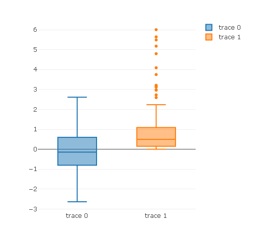
</center>
**3D Scatterplot**
You can create three dimensional scatter plots in `plotly` by having the type as `scatter3d` and having `x`, `y` and `z`. In my computer and RStudio, I found it hard to play with the 3D output. The image below could be better.
```{r}
# 3D Scatter Plot:
plot_ly(x = rnorm(10), y = rnorm(10), z = rnorm(10),
type = "scatter3d",
mode = "markers")
```
<center>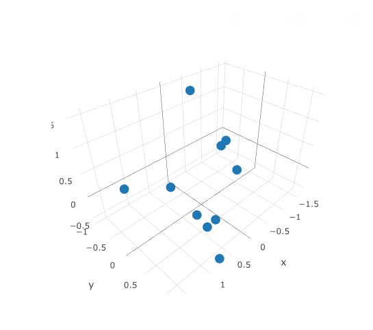</center>
---
Edit: Fixed a few typos.| author | dkmathstats |
|---|---|
| permlink | data-visualization-in-r-with-plotly |
| category | programming |
| json_metadata | {"tags":["programming","r","data","science","technology"],"image":["https://s3-us-west-1.amazonaws.com/plotly-tutorials/plotly-marketing-pages/images/new-branding/logo/images/plotly-logo-01-stripe%402x.png","https://steemitimages.com/DQmbQq5TBmtZX7eYpjua5Wf3cBRqkcCqdM3VajSKxStrcvQ/scatterplot.png","https://steemitimages.com/DQmUjUCZEnfexAsAKCMfAmi9UNSGTyJHerdHyWTBWVgPMxz/linePlot.png","https://steemitimages.com/DQmUZ5Xf76vHVcEj94LXuTwjiXPtEEMT8uz3hYw3kJCy4aM/areaPlot.png","https://steemitimages.com/DQmaMBZHbJ25ABGdEPEhdFbj9QG1Q31y9ivJp423XysoMv6/barGraph.png","https://steemitimages.com/DQmYfJTpS7t9iuGFTGy8y6b2jzcsghcJejFK22u576dLhdN/histNorms.png","https://steemitimages.com/DQmbkFBJqwY4FxmMvn6yZzgAQ3rVSKoKrHu9jcZRXdDb1AE/boxPlot01.png","https://steemitimages.com/DQmUMLAH2noqqLmZMDy47EFmd1b9Jm7pVoobk5H352kjmM2/boxPlot02.png","https://steemitimages.com/DQmc6GT5ssqxXPzcrLQnRkpeCqmrw32qJMXMYH1yuDkJZB4/scatterplot3d.png"],"links":["https://images.plot.ly/plotly-documentation/images/r_cheat_sheet.pdf","https://plot.ly/r/","https://s3-us-west-1.amazonaws.com/plotly-tutorials/plotly-marketing-pages/images/new-branding/logo/images/plotly-logo-01-stripe%402x.png"],"app":"steemit/0.1","format":"markdown"} |
| created | 2017-08-23 15:58:42 |
| last_update | 2017-08-24 03:23:18 |
| depth | 0 |
| children | 6 |
| last_payout | 2017-08-30 15:58:42 |
| cashout_time | 1969-12-31 23:59:59 |
| total_payout_value | 85.040 HBD |
| curator_payout_value | 28.227 HBD |
| pending_payout_value | 0.000 HBD |
| promoted | 0.000 HBD |
| body_length | 4,989 |
| author_reputation | 150,278,811,385,224 |
| root_title | "Data Visualization In R With plotly" |
| beneficiaries | [] |
| max_accepted_payout | 1,000,000.000 HBD |
| percent_hbd | 10,000 |
| post_id | 12,650,733 |
| net_rshares | 27,787,705,174,647 |
| author_curate_reward | "" |
| voter | weight | wgt% | rshares | pct | time |
|---|---|---|---|---|---|
| pharesim | 0 | 106,633,279,443 | 0.28% | ||
| lafona-miner | 0 | 955,411,461,937 | 13.33% | ||
| kushed | 0 | 70,853,555,050 | 3.5% | ||
| justtryme90 | 0 | 284,748,791,116 | 20% | ||
| anwenbaumeister | 0 | 1,017,875,481,702 | 35% | ||
| chamviet | 0 | 1,542,348,051 | 100% | ||
| marcusorlyius | 0 | 3,789,820,754 | 100% | ||
| cryptoninja | 0 | 254,122,191 | 2% | ||
| cristi | 0 | 69,514,982,486 | 20% | ||
| kyriacos | 0 | 58,352,523,830 | 10% | ||
| lemouth | 0 | 24,871,712,479 | 20% | ||
| anarchyhasnogods | 0 | 44,087,899,944 | 20% | ||
| ghasemkiani | 0 | 3,863,405,231 | 1% | ||
| greer184 | 0 | 5,596,860,769 | 100% | ||
| meerkat | 0 | 1,069,038,522,812 | 35% | ||
| curie | 0 | 2,375,392,543,722 | 35% | ||
| hendrikdegrote | 0 | 20,517,374,032,954 | 35% | ||
| steemstem | 0 | 196,274,821,526 | 20% | ||
| the-devil | 0 | 4,025,684,470 | 20% | ||
| dunia | 0 | 740,908,387,982 | 35% | ||
| mckenziegary | 0 | 9,087,574,061 | 35% | ||
| calypso | 0 | 44,850,248,986 | 35% | ||
| brahma | 0 | 95,623,824,799 | 35% | ||
| aarkay | 0 | 112,074,894 | 100% | ||
| mobbs | 0 | 14,708,222,779 | 20% | ||
| bitrocker2020 | 0 | 30,650,859,268 | 49% | ||
| nrg | 0 | 372,943,676 | 1.11% | ||
| alexander.alexis | 0 | 599,308,364 | 6% | ||
| pilcrow | 0 | 23,138,938,586 | 50.51% | ||
| nataliejohnson | 0 | 384,213,120 | 5% | ||
| droida | 0 | 108,704,908 | 100% | ||
| ovij | 0 | 1,163,616,336 | 20% | ||
| runtime | 0 | 652,675,440 | 100% | ||
| originalworks | 0 | 151,564,339 | 1% | ||
| stats-n-lats | 0 | 623,647,504 | 100% | ||
| autodidact88 | 0 | 1,050,374,703 | 100% | ||
| cryptotrader2017 | 0 | 656,155,009 | 100% | ||
| ronaldsteemit89 | 0 | 98,664,469 | 100% | ||
| raykeli89 | 0 | 150,882,506 | 100% | ||
| masterofcoin | 0 | 7,481,389,748 | 100% | ||
| anos | 0 | 150,882,123 | 100% | ||
| m2271991 | 0 | 1,038,764,835 | 100% | ||
| alaahasaki | 0 | 1,015,551,259 | 100% | ||
| fofanos | 0 | 1,160,629,394 | 100% | ||
| domogo | 0 | 1,160,628,306 | 100% | ||
| space-man | 0 | 1,102,596,786 | 100% |
please upvote to me https://steemit.com/food/@anos/ice-cream-steak-with-strawberry and follow me
| author | anos |
|---|---|
| permlink | re-dkmathstats-data-visualization-in-r-with-plotly-20170823t160044293z |
| category | programming |
| json_metadata | {"tags":["programming"],"links":["https://steemit.com/food/@anos/ice-cream-steak-with-strawberry"],"app":"steemit/0.1"} |
| created | 2017-08-23 16:00:48 |
| last_update | 2017-08-23 16:00:48 |
| depth | 1 |
| children | 0 |
| last_payout | 2017-08-30 16:00:48 |
| cashout_time | 1969-12-31 23:59:59 |
| total_payout_value | 0.000 HBD |
| curator_payout_value | 0.000 HBD |
| pending_payout_value | 0.000 HBD |
| promoted | 0.000 HBD |
| body_length | 96 |
| author_reputation | -28,514,146,177 |
| root_title | "Data Visualization In R With plotly" |
| beneficiaries | [] |
| max_accepted_payout | 1,000,000.000 HBD |
| percent_hbd | 10,000 |
| post_id | 12,650,927 |
| net_rshares | 0 |
i was just starting out on ploty, have not gotten the hang of it yet. great technical blogs. are you developing anything on top of steem block-chain ?
| author | bitrocker2020 |
|---|---|
| permlink | re-dkmathstats-data-visualization-in-r-with-plotly-20170824t005627138z |
| category | programming |
| json_metadata | {"tags":["programming"],"app":"steemit/0.1"} |
| created | 2017-08-24 00:56:27 |
| last_update | 2017-08-24 00:56:27 |
| depth | 1 |
| children | 1 |
| last_payout | 2017-08-31 00:56:27 |
| cashout_time | 1969-12-31 23:59:59 |
| total_payout_value | 0.000 HBD |
| curator_payout_value | 0.000 HBD |
| pending_payout_value | 0.000 HBD |
| promoted | 0.000 HBD |
| body_length | 150 |
| author_reputation | 974,750,896,734,572 |
| root_title | "Data Visualization In R With plotly" |
| beneficiaries | [] |
| max_accepted_payout | 1,000,000.000 HBD |
| percent_hbd | 10,000 |
| post_id | 12,689,878 |
| net_rshares | 3,921,670,155 |
| author_curate_reward | "" |
| voter | weight | wgt% | rshares | pct | time |
|---|---|---|---|---|---|
| dkmathstats | 0 | 3,921,670,155 | 100% |
With `plotly` and other data visualization tools in R and Python, there is a lot of syntax involved and it can be confusing. I would say to start with the plotly cheatsheet link above and their documentation.

Are you using R  or Python?

> are you developing anything on top of steem block-chain ?

No I am not.
| author | dkmathstats |
|---|---|
| permlink | re-bitrocker2020-re-dkmathstats-data-visualization-in-r-with-plotly-20170824t010445148z |
| category | programming |
| json_metadata | {"tags":["programming"],"app":"steemit/0.1"} |
| created | 2017-08-24 01:04:42 |
| last_update | 2017-08-24 01:04:42 |
| depth | 2 |
| children | 0 |
| last_payout | 2017-08-31 01:04:42 |
| cashout_time | 1969-12-31 23:59:59 |
| total_payout_value | 0.000 HBD |
| curator_payout_value | 0.000 HBD |
| pending_payout_value | 0.000 HBD |
| promoted | 0.000 HBD |
| body_length | 312 |
| author_reputation | 150,278,811,385,224 |
| root_title | "Data Visualization In R With plotly" |
| beneficiaries | [] |
| max_accepted_payout | 1,000,000.000 HBD |
| percent_hbd | 10,000 |
| post_id | 12,690,368 |
| net_rshares | 0 |
Good intro-post.  I'm interested in what kind of jobs I could get to make use of the data visualisation techniques I've been learning. Are you doing this kind of stuff professionally, or just learning it for enjoyment?

Thanks!
| author | runtime |
|---|---|
| permlink | re-dkmathstats-data-visualization-in-r-with-plotly-20170827t094140142z |
| category | programming |
| json_metadata | {"tags":["programming"],"app":"steemit/0.1"} |
| created | 2017-08-27 09:41:36 |
| last_update | 2017-08-27 09:41:36 |
| depth | 1 |
| children | 1 |
| last_payout | 2017-09-03 09:41:36 |
| cashout_time | 1969-12-31 23:59:59 |
| total_payout_value | 0.021 HBD |
| curator_payout_value | 0.007 HBD |
| pending_payout_value | 0.000 HBD |
| promoted | 0.000 HBD |
| body_length | 227 |
| author_reputation | 108,185,118,203 |
| root_title | "Data Visualization In R With plotly" |
| beneficiaries | [] |
| max_accepted_payout | 1,000,000.000 HBD |
| percent_hbd | 10,000 |
| post_id | 13,010,610 |
| net_rshares | 7,327,079,653 |
| author_curate_reward | "" |
| voter | weight | wgt% | rshares | pct | time |
|---|---|---|---|---|---|
| dkmathstats | 0 | 7,327,079,653 | 100% |
Thank you for your comment @runtime.

> Are you doing this kind of stuff professionally, or just learning it for enjoyment?

For enjoyment and for employment into stats and/or data science.

> I'm interested in what kind of jobs I could get to make use of the data visualisation techniques I've been learning.

I think there is good demand for data visualization skills but I can't say for sure.  Data visualization can be supplemented with skills in data cleaning, data extraction and data analysis (with prediction).
| author | dkmathstats |
|---|---|
| permlink | re-runtime-re-dkmathstats-data-visualization-in-r-with-plotly-20170827t140313677z |
| category | programming |
| json_metadata | {"tags":["programming"],"users":["runtime"],"app":"steemit/0.1"} |
| created | 2017-08-27 14:03:12 |
| last_update | 2017-08-27 14:03:12 |
| depth | 2 |
| children | 0 |
| last_payout | 2017-09-03 14:03:12 |
| cashout_time | 1969-12-31 23:59:59 |
| total_payout_value | 0.000 HBD |
| curator_payout_value | 0.000 HBD |
| pending_payout_value | 0.000 HBD |
| promoted | 0.000 HBD |
| body_length | 519 |
| author_reputation | 150,278,811,385,224 |
| root_title | "Data Visualization In R With plotly" |
| beneficiaries | [] |
| max_accepted_payout | 1,000,000.000 HBD |
| percent_hbd | 10,000 |
| post_id | 13,027,752 |
| net_rshares | 0 |
@dkmathstats welcome to steemit community very nice post have a good day ahead thankyou
| author | saadhashmi |
|---|---|
| permlink | re-dkmathstats-data-visualization-in-r-with-plotly-20170826t201445349z |
| category | programming |
| json_metadata | {"tags":["programming"],"users":["dkmathstats"],"app":"steemit/0.1"} |
| created | 2017-08-26 20:14:42 |
| last_update | 2017-08-26 20:14:42 |
| depth | 1 |
| children | 0 |
| last_payout | 2017-09-02 20:14:42 |
| cashout_time | 1969-12-31 23:59:59 |
| total_payout_value | 0.000 HBD |
| curator_payout_value | 0.000 HBD |
| pending_payout_value | 0.000 HBD |
| promoted | 0.000 HBD |
| body_length | 88 |
| author_reputation | 29,360,148,946 |
| root_title | "Data Visualization In R With plotly" |
| beneficiaries | [] |
| max_accepted_payout | 1,000,000.000 HBD |
| percent_hbd | 10,000 |
| post_id | 12,965,283 |
| net_rshares | 0 |