It's good to see Openledger are finally doing what is right, after the recent hack that happened on their exchange. Openledger has upgraded their security and days later after that, they upgraded their UI/UX that's really astonishing.
Here's a quick look on what you'll see on Openledger Dashboard.
<center>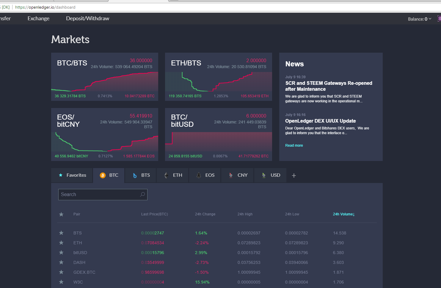</center>
Just by looking into your dashboard, you will already have idea what's happening on the market. There's also list of trading pairs, which is really cool and the best part of that is you can customize what's asset are going to appear on your dashboard.
They also add a little panel that shows what's new on Openledger.
> I think they should add an shortcut to their Twitter page, Telegram page, or even Facebook.
Here is an overview of Bitshares DEX dashboard. See the comparison.
<center>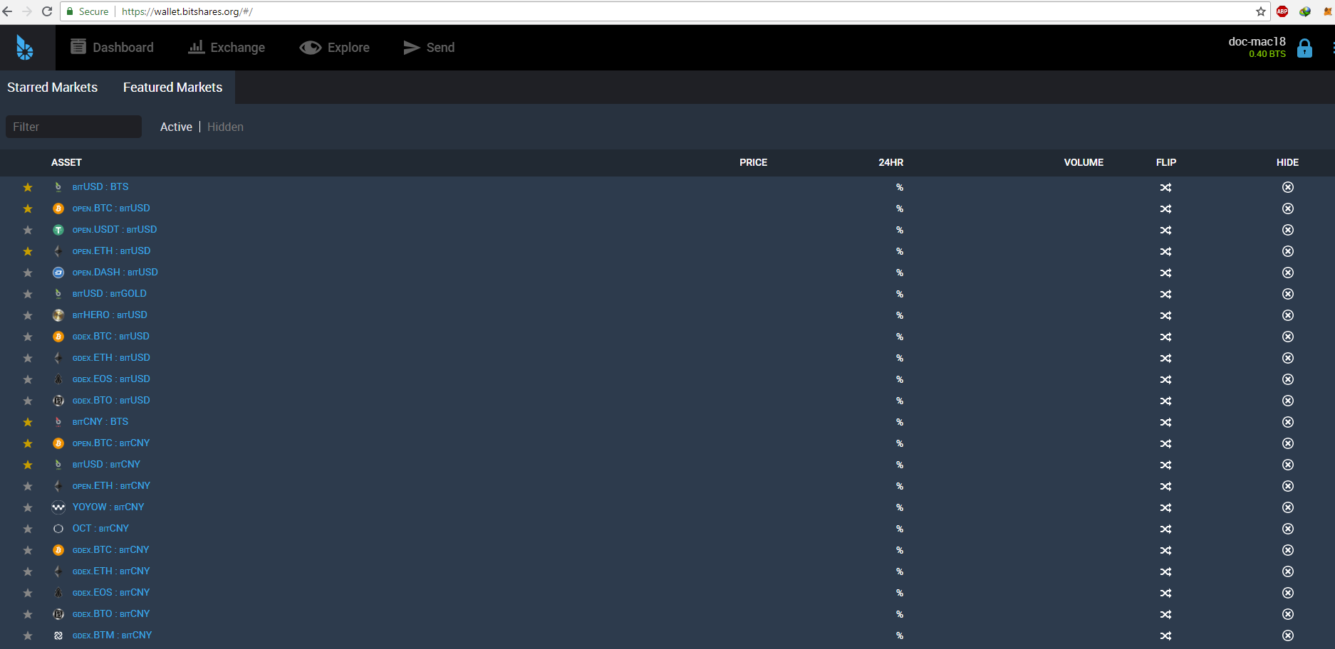</center>
I like the Openledger dashboard in many ways.
After going into the Market(using Openledger), I saw these really good feature that has a basic trading mode and advance trading mode. Which is useful for new traders that are getting confused with all the data that they are seeing on the input when buying and selling their assets.
<center>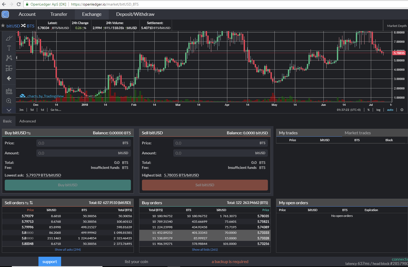</center>
`basic mode`
<center>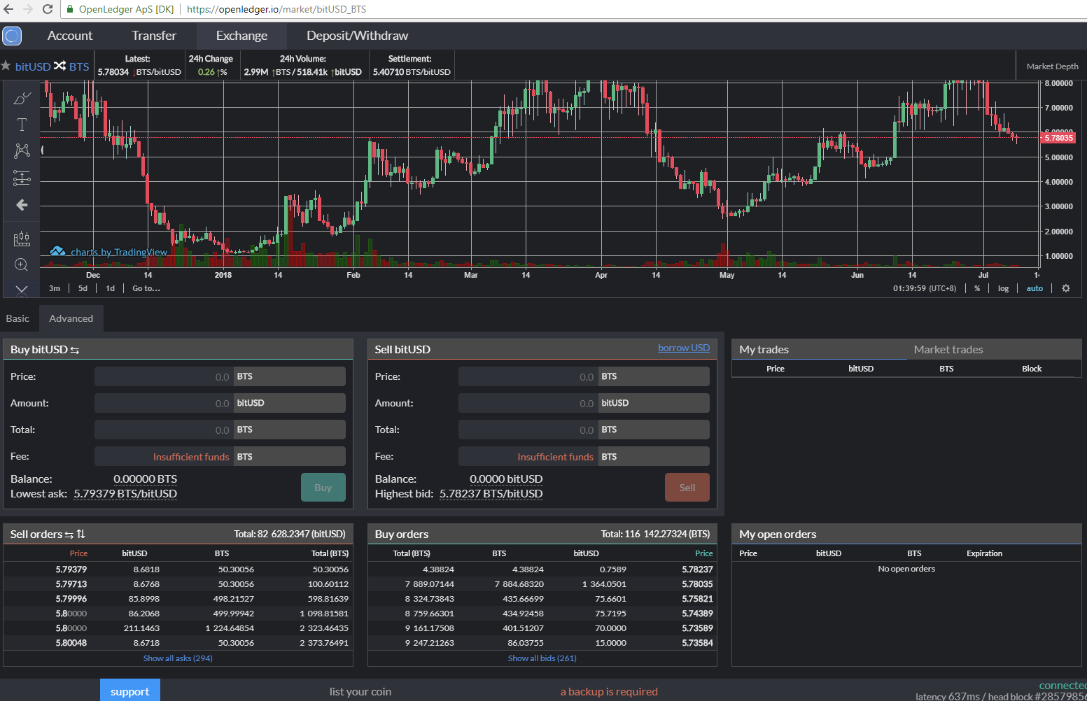</center>
`advance mode`
See how the difference in the buy and sell option.
The only thing that I don't like is, the fonts are too small on the list of buy and sell orders. Which is kinda difficult for someone like me that has problem with visions.
Here's the full view of Openledger market page
<center>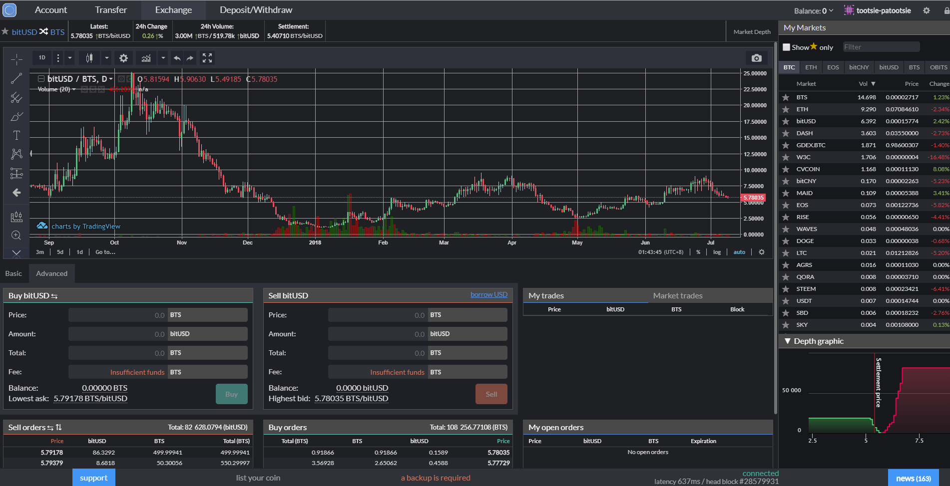</center>
Here's Bitshares DEX market page
<center>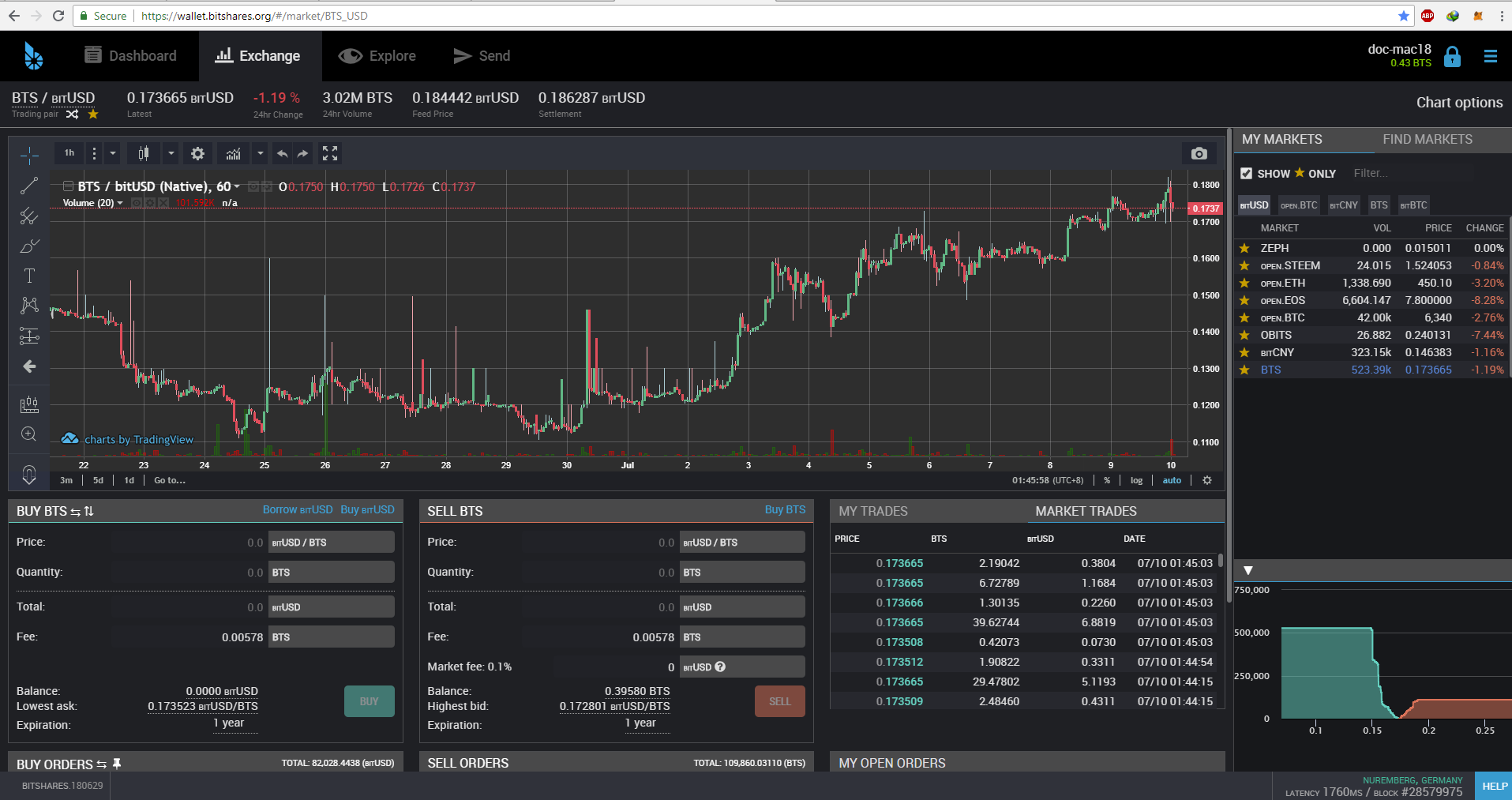</center>
For me, I find Openledger's new UI/UX more user friendly than the native Bitshares DEX.
It's good that Openledger are now implementing their updates, maybe we can see more from them in the future. A FIAT gateway, OCASH, OBITS website upgrade and roadmap.
 hiveblocks