Does anyone else remember when web designs were made to work on different screen sizes by using full browser-width tables?
We would make the left and right columns empty all but for a single pixel transparent gif, or an ``` ```, that would allow some margins.
Ah, those were simpler times.
Now we need to contend with many different screen sizes, not just 800px versus 1024x768! In fact, it is not just the sizes of screens or even browser differences, but now our user interfaces might be close to the user's nose or far away.
With CSS and NodeJS/NextJS we have a couple of handy tools that make the life of a front-end developer just a little less frustrating.
First of all, let's take a look at *media queries*.
## CSS Media Queries
If you are very smart and careful with ems, floats, percentages, and such, I am sure you can make one stylesheet that works across every device imaginable.

I just don't have that kind of time!
But also we might want to have our content display very differently on a phone versus, say, a high-resolution desktop.
Consider the burger menu as an example:

We don't want this to show up on any regular screens, just mobile.
The way we do this is by asking the browser to use a little logic, we query the browser to ask what type of device we are on, and what the screen area is sized at.
```
/* On screens that are 400px or less, set the height to 250px */
@media screen and (max-width: 400px) {
.hero {
background-position:center;
width: 100%;
height: 250px;
}
}
```
Media queries are now a basic CSS technique, but they were only first officially introduced with the release of CSS3.
Mostly we will use Screen here, but I am sure you can imagine how we might use Print or Speech as the media type!
For our purposes today we are looking at the viewport of the screen. Think of ```max-width``` as being "up-to", and ```min width``` being "or above".
This is very handy, it allows us to for example show our recent articles in a grid on wide screens and as a list on smaller screens, to change the navigation, and even to remove items that don't make sense on that device.
```
.hero {
visibility:hidden;
}
/* Only show on desktop: */
@media only screen and (min-width: 768px) {
.hero {
visibility:visible;
}
}
```
There are a bunch of example media queries available over at [CSS Tricks](https://css-tricks.com/snippets/css/media-queries-for-standard-devices/), they cover a whole raft of different screens, plus the examples are probably the best way of learning to bend it to your own will than any explanation I could give.
<center>
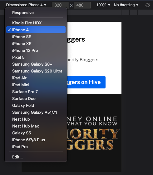
<sup>Chrome and Brave allow you to view your site in different modes to test your responsive design</sup>
</center>
## Getting Sassy
Hard coding all these sizes and such just gets to be a pain eventually, especially when you want to do a design tweak right across your entire set of styles.
Finding everywhere you said '400px' and changing it to '375px' without searching and replacing across every single instance soon gets old.
Some amazing people developed CSS preprocessors though - these allow you to use variables, and more!
Now we can do this kind of deal ...
```
@media screen and (max-width: $breakpoint-phone) {
.hero {
background-position:center;
width: 100%;
height: 250px;
}
}
```
Yep, we have a variable called ```$breakpoint-phone``` which is the width we want phone-related stuff to be based upon.
In our variables list we can then decide on a bunch of widths, try them out for ... size ... then tweak *in one place* to ripple that change right across the website (or app).
```
$breakpoint-phone: 400px;
$breakpoint-tablet: 800px;
$breakpoint-desktop: 1024px;
```
It doesn't end there either.
For example, I am building a Hive front end for my new community, [Authority Bloggers](https://www.authoritybloggers.com/) but I don't want to build it JUST for Authority Bloggers, maybe @diggndeeper.com will want to use it for his community, or even @themarkymark might find useful pieces for [STEMGeeks](https://stemgeeks.net).
Well Sass helps there too because I can set some core colours, put them in one file, and anyone can come along later and change them to match *their* brand, and have everything still work.
```
$color-primary: #0070f3;
$color-secondary: #AA70f3;
$color-black: #000;
$color-white: #fff;
$color-dark-gray: #1f1f1f;
$color-light-gray: #f2f2f2;
$color-mid-gray: #606060;
```
## What Next?
My Hive front end is changing, look out for the next articles where I go into how I am using some new technologies and old together to bring about a better Hive community experience ...
| author | makerhacks |
|---|---|
| permlink | making-your-hive-front-end-mobile-responsive |
| category | hive-139531 |
| json_metadata | "{"app":"peakd/2022.01.2","format":"markdown","description":"Make your design work elegantly across all manner of browsers and devices","tags":["programming","javascript","webdesign","python","stemgeeks","technology"],"users":["media","diggndeeper.com","themarkymark"],"image":["https://files.peakd.com/file/peakd-hive/makerhacks/23x1ccir4nuPHxCjC1LunYxqAnySNQN2SFCQsTmTcjvHNRq7nJNKyqSDB9gyyM1xYeaWN.png","https://files.peakd.com/file/peakd-hive/makerhacks/EoAZHKhRMYfratgTgurroZrHSxJd5QprVK2HsL8hkDTLPtJ91DMXzjQfTGhNADQEmQQ.png","https://files.peakd.com/file/peakd-hive/makerhacks/EoeEucb2uNeUdwMViRoeYSJifanJkrQYN2fhp2GoT4oFY6zUT3FdvAD6DEXV6y1YtU5.png","https://files.peakd.com/file/peakd-hive/makerhacks/23u6WzZYdR7aTByS5vBSvLD99npCabmtkGeiQ7vSQS2dJdhTijofV9QsKnsJUdKmznBrS.png","https://files.peakd.com/file/peakd-hive/makerhacks/23yTYt1DPrdETpzXFwvgGKvdUDh3LArckscHeWTR7UQYunPHrR34tbn7ikiT9gbMcipa4.png"]}" |
| created | 2022-02-20 01:51:30 |
| last_update | 2022-02-20 01:51:30 |
| depth | 0 |
| children | 2 |
| last_payout | 2022-02-27 01:51:30 |
| cashout_time | 1969-12-31 23:59:59 |
| total_payout_value | 14.760 HBD |
| curator_payout_value | 14.724 HBD |
| pending_payout_value | 0.000 HBD |
| promoted | 0.000 HBD |
| body_length | 5,411 |
| author_reputation | 156,977,359,570,955 |
| root_title | "Making Your Hive Front-End Mobile Responsive" |
| beneficiaries | [] |
| max_accepted_payout | 1,000,000.000 HBD |
| percent_hbd | 0 |
| post_id | 110,631,312 |
| net_rshares | 27,318,568,336,740 |
| author_curate_reward | "" |
| voter | weight | wgt% | rshares | pct | time |
|---|---|---|---|---|---|
| modeprator | 0 | 568,074,331 | 75% | ||
| mammasitta | 0 | 1,197,127,616 | 0.3% | ||
| arcange | 0 | 659,762,172,388 | 5% | ||
| raphaelle | 0 | 6,094,155,906 | 5% | ||
| daveks | 0 | 768,566,386,137 | 12% | ||
| penguinpablo | 0 | 264,495,039,664 | 12% | ||
| funnyman | 0 | 1,080,849,851 | 4.8% | ||
| slider2990 | 0 | 2,861,165,474 | 20% | ||
| walterjay | 0 | 10,032,438,867 | 0.87% | ||
| voter | 0 | 2,123,506,221 | 100% | ||
| ripperone | 0 | 1,952,296,304,574 | 29% | ||
| steemitboard | 0 | 17,272,471,189 | 3% | ||
| diggndeeper.com | 0 | 3,743,926,470,607 | 100% | ||
| freebornsociety | 0 | 809,070,725 | 6.5% | ||
| lizanomadsoul | 0 | 1,137,157,871 | 2% | ||
| alphacore | 0 | 4,771,162,028 | 2.42% | ||
| themarkymark | 0 | 3,738,135,209,524 | 10% | ||
| leaky20 | 0 | 89,582,220,731 | 50% | ||
| vimukthi | 0 | 58,207,644,201 | 20% | ||
| buildawhale | 0 | 7,444,340,436,144 | 10% | ||
| x30 | 0 | 660,710,703,873 | 10% | ||
| klevn | 0 | 57,878,467,533 | 100% | ||
| afterglow | 0 | 1,052,431,392 | 2.5% | ||
| mytechtrail | 0 | 57,546,818,749 | 15% | ||
| nathen007 | 0 | 9,590,155,228 | 100% | ||
| cryptonized | 0 | 17,679,724,754 | 12% | ||
| upmyvote | 0 | 3,157,114,067 | 10% | ||
| edicted | 0 | 6,167,188,883,213 | 100% | ||
| manncpt | 0 | 1,964,514,412 | 2% | ||
| the-reaper | 0 | 578,520,778 | 100% | ||
| steemflagrewards | 0 | 385,977,915,198 | 100% | ||
| skybreaker | 0 | 511,010,680 | 100% | ||
| supreme-verdict | 0 | 1,597,033,535 | 100% | ||
| christopher2002 | 0 | 0 | 100% | ||
| onepercentbetter | 0 | 15,493,749,866 | 12% | ||
| gogreenbuddy | 0 | 39,128,891,059 | 10% | ||
| globalschool | 0 | 931,946,451 | 1% | ||
| enforcer48 | 0 | 118,866,431,062 | 15% | ||
| merlion | 0 | 595,648,729 | 12% | ||
| pboulet | 0 | 1,700,814,902 | 1.75% | ||
| admiralbot | 0 | 5,953,284,735 | 100% | ||
| shainemata | 0 | 857,929,214 | 2.5% | ||
| jacuzzi | 0 | 3,696,934,617 | 1.2% | ||
| limka | 0 | 81,702,726 | 80.19% | ||
| hungrybear | 0 | 522,529,002 | 12% | ||
| memehub | 0 | 80,154,760,155 | 100% | ||
| tinyhousecryptos | 0 | 503,397,461 | 5% | ||
| aninsidejob | 0 | 6,047,002,944 | 100% | ||
| babytarazkp | 0 | 4,006,969,647 | 40% | ||
| abh12345.stem | 0 | 2,011,345,316 | 100% | ||
| build-it | 0 | 476,798,474,053 | 100% | ||
| khalstem | 0 | 1,670,251,873 | 100% | ||
| yggdrasil.laguna | 0 | 672,778,488 | 75% | ||
| cd-stem | 0 | 524,121,480 | 100% | ||
| stemisaria | 0 | 1,863,201,671 | 100% | ||
| chapmain | 0 | 134,230,368 | 100% | ||
| fengchao | 0 | 50,323,103,231 | 5% | ||
| hivebuzz | 0 | 5,525,136,066 | 2% | ||
| laruche | 0 | 80,450,689,339 | 1.75% | ||
| schmidi | 0 | 551,356,929 | 1% | ||
| recoveryinc | 0 | 3,035,381,046 | 5% | ||
| pfwaus | 0 | 1,091,308,707 | 100% | ||
| dorkpower | 0 | 3,551,668,996 | 100% | ||
| stemcur | 0 | 643,976,862 | 100% | ||
| brofund-stem | 0 | 2,773,202,084 | 75% | ||
| nathen007.stem | 0 | 280,413,547 | 100% | ||
| sillybilly | 0 | 509,909,481 | 100% | ||
| meestemboom | 0 | 465,141,895 | 25% | ||
| academiccuration | 0 | 747,102,766 | 100% | ||
| krishu.stem | 0 | 889,529,594 | 100% | ||
| samrisso | 0 | 3,436,766,753 | 5% | ||
| bananass | 0 | 1,757,339,591 | 10% | ||
| arunbiju969 | 0 | 2,314,236,157 | 14% | ||
| juecoree.stem | 0 | 639,414,735 | 100% | ||
| holovision.stem | 0 | 58,933,617 | 50% | ||
| oldsoulnewb | 0 | 3,129,507,003 | 100% | ||
| solominer.stake | 0 | 756,640,629 | 75% | ||
| apeminingclub | 0 | 49,663,193,996 | 10% | ||
| marshmellowman | 0 | 779,311,326 | 27% | ||
| jordand89 | 0 | 73,769,601,080 | 100% | ||
| tyrnis.curation | 0 | 515,861,831 | 50% | ||
| captainglondo | 0 | 9,428,338,740 | 100% | ||
| sapadetzero | 0 | 8,150,319,558 | 50% | ||
| kvinna | 0 | 109,784,987,565 | 100% | ||
| bricksolution | 0 | 2,808,950,413 | 15% | ||
| felixicarus000 | 0 | 1,877,523,262 | 100% | ||
| ptmaker | 0 | 3,950,736,661 | 100% | ||
| nony | 0 | 0 | 100% | ||
| enochdanijel | 0 | 0 | 100% |
> I am building a Hive front end for my new community, Authority Bloggers but I don't want to build it JUST for Authority Bloggers

It will be awesome to witness such project
| author | emeka4 |
|---|---|
| permlink | r7lcka |
| category | hive-139531 |
| json_metadata | {"app":"hiveblog/0.1"} |
| created | 2022-02-20 06:55:27 |
| last_update | 2022-02-20 06:55:27 |
| depth | 1 |
| children | 1 |
| last_payout | 2022-02-27 06:55:27 |
| cashout_time | 1969-12-31 23:59:59 |
| total_payout_value | 0.060 HBD |
| curator_payout_value | 0.058 HBD |
| pending_payout_value | 0.000 HBD |
| promoted | 0.000 HBD |
| body_length | 174 |
| author_reputation | 234,166,618,016,346 |
| root_title | "Making Your Hive Front-End Mobile Responsive" |
| beneficiaries | [] |
| max_accepted_payout | 1,000,000.000 HBD |
| percent_hbd | 10,000 |
| post_id | 110,636,113 |
| net_rshares | 110,231,326,064 |
| author_curate_reward | "" |
| voter | weight | wgt% | rshares | pct | time |
|---|---|---|---|---|---|
| makerhacks | 0 | 108,536,681,822 | 100% | ||
| stemgeeks | 0 | 1,625,898,408 | 6% | ||
| stemcuration | 0 | 68,745,834 | 6% | ||
| yggdrasil.laguna | 0 | 0 | 3% | ||
| saboin.stem | 0 | 0 | 6% |
I am working on it, thank you for the encouragement ;)
| author | makerhacks |
|---|---|
| permlink | re-emeka4-r7mj8f |
| category | hive-139531 |
| json_metadata | {"tags":["hive-139531"],"app":"peakd/2022.01.2"} |
| created | 2022-02-20 22:17:03 |
| last_update | 2022-02-20 22:17:03 |
| depth | 2 |
| children | 0 |
| last_payout | 2022-02-27 22:17:03 |
| cashout_time | 1969-12-31 23:59:59 |
| total_payout_value | 0.000 HBD |
| curator_payout_value | 0.000 HBD |
| pending_payout_value | 0.000 HBD |
| promoted | 0.000 HBD |
| body_length | 54 |
| author_reputation | 156,977,359,570,955 |
| root_title | "Making Your Hive Front-End Mobile Responsive" |
| beneficiaries | [] |
| max_accepted_payout | 1,000,000.000 HBD |
| percent_hbd | 10,000 |
| post_id | 110,656,237 |
| net_rshares | 0 |
 hiveblocks